- Today in Design
- Posts
- Welcome to the Friday Edition
Welcome to the Friday Edition
Today in Design Acquired, Gil Huybrecht's Secrets, Raycast launches Notes

Welcome to the Friday Edition™
This inaugural issue is an experiment. Is the design good enough? Is it too lengthy? Will people enjoy it? Like any creator introducing something new to the world, we’ve felt a small dose of existential dread. What matters is this: we’re trying to create something great for designers. Far too many times in my career, I’ve seen prominent people in our industry build a platform, preach community, and then fail to give back to that community. I want our story to be different. Today in Design is a way of putting my money where my mouth is. If you love it, please let me know. If you hate it, please lie to me about it and tell me you love it. And don’t worry, we’ll be back to our normal content Monday - Thursday. Enjoy. |

Raycast launches Notes to help us all find our flow. |
It’s safe to say that designers love Raycast. Giving non-technical folks the ability to navigate virtually their entire computer with only their keyboard is no small accomplishment. Most days, I’m surprised at how much hype a silly spotlight replacement has garnered. Then I hit ⌘Space, and I’m instantly reminded why: it’s so damn fast. Whether searching through Linear tasks, Figma files, or pulling from my Clipboard History, it’s a clean, frictionless experience. It doesn’t obstruct - it keeps you moving. With Notes v2, they’ve added more features to a notes window that can’t be hidden or minimized, only closed—and reopened. It seems that’s where Raycast is injecting its design perspective the most. Floating Notes are for capturing or recalling something now. You can store your notes there, but another app probably does that better. Raycast wants to help you use your notes, not abandon them. |

Why the Future of Product Design Is All About How It Feels

Gil Huybrecht On Designing With Heart (and a little humor) |
Have you ever wondered how Gil Huybrecht’s work grabs Site of the Day from Awwwards like it’s no big deal? |
Your work seems to always grab SOTDs on Awwwards. What’s been the biggest inspiration for your style? |
First, thank you for the interview. It’s always fun to talk design!
|
What’s your process like going from Figma to interaction? |
It’s definitely something that happens together. Designing something might spark an idea for an animation, so I’m usually going back and forth from design to animation to see if what I had in my head also actually works. I don’t use the animation features in Figma because designing and animating in the same file gets very messy. I use a program called Principle. It’s super easy to use, and I just copy what I need when animating something. I would still love to learn After Effects better, but it feels like a plane's cockpit. |
Man, I go way back with Principle. I love that you’re using a pure prototyping tool and not chasing something like Framer or Webflow to create your interactions. Does it keep you in a creative headspace, versus something that feels like a chore? |
Yeah, definitely; I don't care too much about tools. I only started using Figma a year ago because clients started asking for it, I always used Sketch before, haha. And as you said, having specific tools for specific jobs keeps me more in the zone while working. |
I’m picking up a theme here. You’re one of the actual go-to designers for many studios, yet you’re not following the hype like most designers. Do you feel like the search for the latest and greatest tool gets in the way of evolving your creative output? |
Yeah, I think it can definitely get in the way. But I also can be a lack of clarity as a designer. My style is very much centered around typography and grid usage. This is all grounded in design fundamentals. I remember when I was younger, I didn’t have that clarity, and then it was way easier to gain confidence as a designer by knowing and using the latest tools. |
Typography and grid are design 101 yet something so few get right. How has chasing the fundamentals evolved your taste and style vs. chasing trends? |
It’s been a night and day difference, to be honest. Early on, everything was more about trends. At some point, I was working in an agency and got burned out. In 2021, I started freelancing full-time, and looking at typography-driven work reignited that passion again, so I kind of ‘reinvented’ my style since then, and it’s been super fun designing since then again. |
From the outside, it seems that journey has allowed you to carve your own style. How do you think that’s contributed to staying busy as a freelancer? |
It has definitely helped. It’s a combination of consistently posting on social media (I've been doing that since 2011), finding a niche you love, and backing it up with social proof (SOTD on Awwwards, for example). The niche I kind of landed in by accident is designing websites for creative agencies. |
Speaking of social media, Twitter has become the new, de facto Dribbble. What mistakes do you see up-and-comers making when establishing their identity and getting work? |
Great question! For me, Dribbble was everything back in the day, haha. It was such a great time in design; everything revolved around the work. A mistake I see happening nowadays is juniors wanting to be ‘experts’ so badly without putting in the time. They focus more on educational stuff, trying to grow their accounts without having a clear direction. They share stuff like ‘nEveR uSE pUrE bLacK iN yOur dEsIgN.’ It just screams juniors talking to other juniors. It’s all very simple for me: share work consistently. If the clients don’t come, it means I need to get better. |
It seems you’re talking about the rise of hustle-porn and monetary status signaling in the design community. I see that as a side effect of chasing an algorithm like Twitter vs. something purely visual like Dribbble was. How do you think that’s changed the design community as a whole? |
Zooming out, it all comes down to authenticity for me. I love seeing someone doing great on whatever social platform, helping people, sharing work, posting tips, etc. When someone does that and is very true to themselves, it’s just inspiring to see. Then there’s the other side, where people do very unauthentic stuff with the sole purpose of gaining followers or money while not sharing much value. Let’s hope the unauthentic online hustler trend will soon be gone. |
So, you won’t be talking about MRR or throwing clouds into your designs anytime soon? |
Hahaha. Definitely not. |
Whose work inspires you lately? |
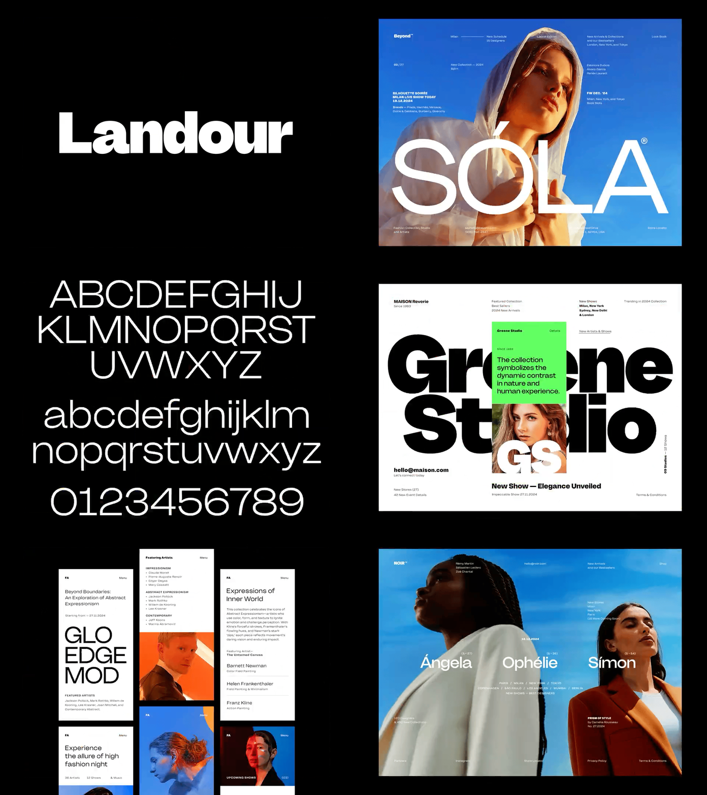
There are many studios and designers I admire. Studio-wise, I would say Christopher & Doyle, Studio Size, Porto Rocha, the new company, Locomotive, Halvah, and Holographic. The latter was founded by Hrvoje Grubisic, who inspired me very early on with his typography-driven work. It showed me that you can do a lot with the basics. Besides that, I love Dieter Rams' Principles of Good Design. Besides that, Savee as a platform has inspired me as well. When you follow the right people, you see a lot of cool shit on there. |
What project you’ve worked on means the most to you? Which one helped you grow the most as a designer? |
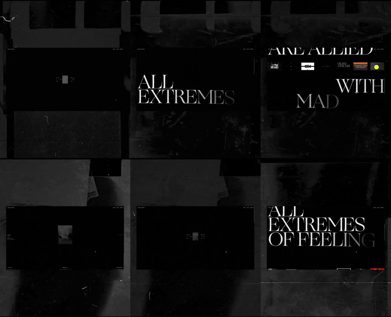
The one that helped me grow the most must be Ark-Shelter. It was a project at the agency where I really wanted to do something different and go all out. It was my first time working with a creative developer, whom we brought on as a contractor. I learned a lot with that project about process and how working with a developer is a collaboration, not a handoff point. It was also my first SOTD on Awwwards, so I would say it’s also the one that means a lot to me. I never thought SOTD was the main goal for a site, but it was a personal goal at the time to win one, and getting it was pretty epic. |


|
What’s been your favorite project so far?
Ironically, the one I can't share yet due to NDA. I'm a huge fan of motorsports - in 2021, I had the privilege of working on UI/3D designs for a major racing series. It's not Formula 1, but it's pretty close - hopefully, I'll be able to share it soon! |
Where are you finding inspiration?
My go-to platform is Layers - it's super fresh in all aspects, and I find many great new designers there. Also, I see many awesome designs coming straight into the Awwwards Jury Panel. I'm honored to be one of the judges there because it gives you a great perspective on the latest design techniques and trends, and you're often among the first to see them. I also recommend the public, non-jury Awwwards/FWA directory too! |
How do you get into flow?
1. Ultra-hard bass/techno music without vocals, just a ton of bass and some drums. Scientifically proven method! 2. Some sketches first, then going straight to high-fidelity. Leaving all the 'polishing' and secondary stuff like auto-layout till the ending phase of the project helps me a lot! |
What else should we know about you?
I have two cats and a strong allergy to cat fur. Despite having this combo, we're living well together (and with some medication, haha) |

|
Where do you find inspiration?
I love finding inspiration in my surroundings, in books, or in art. I always try to incorporate some kind of natural flow in my design or find art styles that represent my vision. |
How do you get into flow?
My goto method for a while now has been pen+paper+Spotify+coffee. Whenever I have to start working, I must have something to write on, doddle, or sketch. Doing something physical really helps me focus on the tasks, and it stops me from procrastinating. (Also keeps the creativity flowing) |
What else should we know about you?
I am deeply committed to creating something unique each time. I’ve always had a passion for designing. Started drawing and painting for fun since i was about 10. For half of this time, I wanted to be an architect before discovering all of this, so fine touches and systems are in my blood. :) |

Today at 12pm CT |
Today at 11am CT |

Webflow Wants To Help With All Your Font Previews | Framer Launches a Google Sheets Plugin For All You Nerds |


