- Today in Design
- Posts
- Framer thinks $200k isn't enough...
Framer thinks $200k isn't enough...
James McDonald shares his secrets, Joey Banks teaches us Auto Layout, and more

Issue #002
Iteration as the default.
As designers, our entire process relies on iteration. No layout starts out perfect, and no one ships their first attempt at an interface. Our greatest works emerge from trial and error—⌘Z is embedded in our DNA.
However, designers can also be among the most opinionated and quick to judge within the creative community. Design Twitter™ often buzzes with hot takes and critiques of rebrands, interface changes, or the latest landing pages. At times, it feels like the community is racing to clout chase or win internet points with their hot takes — neither of which benefit the designers doing the work.
As a community, we build on the work of others. Our inspiration-gathering tools like Layers, Mobbin, and Cosmos are filled with the contributions of fellow designers. The product you celebrated yesterday and criticized today was created by someone just like you. They are doing the hard work and iterating, and that effort deserves celebration.
Here’s my ask: Remember that it takes courage to ship something new. If something elicits a strong reaction, try to be thoughtful and distill that into thoughtful feedback to support your fellow designers. That’s how a great community should operate.
Framer pays out $206k to just over 250 partners and makes Motion open-source |
A trend is emerging between Framer and Webflow, and I suspect it’s intentional. Webflow acquires GSAP, while Framer spins Motion out as an open-source project. Webflow continues to find new ways to charge us more (I’m looking at you, Analyze), whereas Framer discovers new ways to put money in our pockets.
Before you accuse us of promoting Framer, let me clarify that we’re not sponsored by them in any way (although, sup Jorn?). Most of the work we’ve delivered over the past 12 months has been on Webflow. Still, I can’t help but admire how Framer is positioning itself lately.
Framer offers a highly lucrative commission structure of 50% for any customers you refer, while Webflow tops out at 20%. Additionally, there are revenue-generating opportunities like templates and plugins. They’ve made everything so transparent and accessible that it should be a no-brainer for most designers.
Framer’s move to open-source Motion shows they’re focused on strengthening the community and collaboration. By making it open-source, they’re inviting developers to contribute and innovate, which will only make Motion better and more adaptable.
On the flip side, Webflow buying GSAP could mean enhancements down the line, but it also makes you wonder about future costs and how accessible those features will be. If they start charging more for these new capabilities, it might turn off designers and developers who are keeping an eye on their budgets.
Sketch teaches us how to design tinted iOS app icons

James McDonald shares the secrets to clean design, perfected.
From the outside looking in, it seems that James McDonald has influenced some of our favorite parts of the internet. Here’s a quick list: Tailwind, Reflect, Causal, Raycast, and Whop. I personally use some of these products daily (I’m looking at you, Reflect), so I was eager to learn more about his approach to creating such clean yet vibrant interfaces.
You’ve cultivated this reputation for beautiful, clean design and great animation. How do you approach a project? |
My approach begins with immersing myself in the details to fully understand what the client wants to communicate. I start by gathering insights into their objectives, target audience, and core values, which lay the groundwork for shaping a clear and focused creative direction.
Love this outcome oriented approach. Are you usually working from a set of KPIs and predefined roadmap, or are you aligning on those with clients? |
I prefer joining projects where the foundation is already set. I really enjoy focusing on the design process and working through ideas, without getting too deep into research or roadmapping. My happy place is inside Figma, throwing ideas at the canvas and hoping something resonates with the client.
Where do you draw inspiration? I think a ton of designers are curious about the foundations of your style. |
Lots of different places, but most of my inspiration comes from the usual places like Twitter, Dribbble, Mobbin. A website I love right now is Saaspo (https://saaspo.com/) — a great resource if you’re starting out a landing page project.
You produce some really detailed, thoughtful work. What’s your iteration process like? |
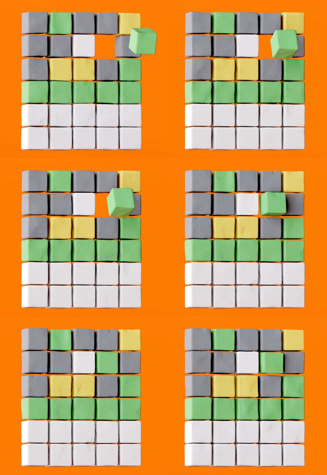
This image from a client project perfectly captures my iteration process. I’m not a fan of losing work or overwriting anything, so I tend to keep duplicating artboards to explore new ideas while preserving previous versions.
I’ve honestly used this method since using Photoshop back in the day. It’s engrained into my process 😅
Any tips you have to share on organizing your iteration and keeping clients in the loop? |
During the design process, I focus primarily on the creative aspects rather than organizing everything upfront. I typically handle the organization—like breakpoints, arranging buttons, and refining the UI—towards the end of the project.
However, I proactively keep clients in the loop by sharing Figma links to specific artboards and sending screenshots, ensuring they’re always updated on the progress.

How often are you involving your clients and gathering feedback? How do you think that impacts your creative process? |
I usually approach projects section by section, rather than completing a full-page design before asking for feedback. I prefer to ask for feedback continuously, as I find this keeps projects moving along more efficiently.
Section by section is an interesting approach, but it makes sense. Are you pairing Figma with interaction prototypes when getting feedback? |
Not really—I mainly use prototyping tools to quickly create simple animations, usually to convey an idea to a developer, like for an illustration or similar element. In 2025, though, I’m aiming to dive into more prototyping stuff, as I’ve seen some designers utilise it really well in their designs.
You’re one a small handful of designers that have built a large platform on social. How was that audience helped you? |
Share your work consistently, and a few things will start to happen:
1. You’ll often receive feedback—ideally meaningful feedback—that helps you improve.
2. You’ll naturally build a following of people who appreciate your work and style.
The key is to keep at it over time; that’s what really makes the difference.
Love the focus on sharing work and not engaging with Design Twitter. What’s your process like when moving from Figma to Dev - how are you collaborating with developers? |
I think thats another important part of it. Engage in meaningful design related conversations. Also, if you like someone’s work — tell them! It’s nice to be nice!
I’ve been fortunate to work with developers who have a bit of design know-how. They often handle a lot of the heavy lifting, and I try to make their lives easier by being as detailed as possible in Figma. From designing for various screen sizes and devices to ensuring there’s a clear understanding of button sizes, shadows, typography, and more.
A significant portion of my time spent with developers is mostly dedicated to fine-tuning complex animations, ensuring things like timing and visuals align perfectly with the project.
How do you communicate those details? Any prototyping tools that are crucial to your workflow? |
Honestly, I mainly work with Figma prototypes. For any animation work, I typically design each frame of the illustration, like frames in a movie. And then articulate to a dev on how something might move or get from point a to b.
You’ve been fortunate to work on some pretty impactful pieces of design for the internet, like tailwind. What do you think the big trends are and which do you think will last? |
It’s always tricky to know which trends will actually stick. Lately, animations seem to be everywhere, especially on marketing sites, bringing feature sections and illustrations to life. If they’re done thoughtfully and really help convey a message, I think they can be a great addition.
Personally, I’m a fan of sites like Campsite.co and Agora.xyz. I appreciate the unique approach they take with their unconventional, narrow content containers.
I think you’ll see a noticeable upward trend of people utilising AI in their designs as well, whether that’s a good or bad thing remains to be seen!
More and more clients are sending me rough visual directions created with tools like Midjourney.
It’s a huge time-saver: fewer misunderstandings, clearer insight into their vision, and honestly, it makes the briefing process way more fun.
— Fons Mans (@FonsMans)
11:32 AM • Nov 14, 2024
Fons… Please show us examples. We need to see. Also… “We design everything $500. You design everything $5,000”
7 quality of life updates to variables:
→ Copy + paste across collections
→ New variables under selection
→ Hover to show value and description
→ Hover to show group names
→ Tabbing through authoring window
→ Improved input accessibility
→ Resize columns— Figma (@figma)
6:30 PM • Nov 12, 2024
I still don’t understand how variables work. But this is a good thing, right?
not sure how people have been making their text 𝒻𝒶𝓃𝒸𝓎
but i've been using this local @raycastapp extension and it's sooo 𝒸ℴ𝓃𝓋ℯ𝓃𝒾ℯ𝓃𝓉 𝒶𝓃𝒹 𝒻𝒶𝓈𝓉
— Pedro Duarte (@peduarte)
2:46 PM • Nov 13, 2024
Pedro is becoming the vibes king of Design Twitter and I’m here for it. Bring on the Fancy Fonts.
i built an app with ZERO coding experience using AI.
it was the happiest day of my life.
here's why i don't recommend anyone doing the same.
my learnings and reflections:
🧵
— 0xDesigner (@0xDesigner)
11:47 PM • Nov 10, 2024

|
What’s been your favorite project so far?
One of my favorite projects has been Blob3D. Designing and developing the website and UI for the 3D Blob Generator was a challenging but rewarding experience!
Where are you finding inspiration?
I get ideas from Dribbble, Instagram, Twitter and from everyday lifestyle.
How do you get into flow?
I need a quiet environment to get started. Once I have that, I can begin designing the ideas I have, which often leads to great results.
What else should we know about you?
I love both designing and developing. My goal is to keep building and inspiring through my work.

|
What’s been your favorite project so far?
My favorite project to work on has probably been either Cap or Tierra - because I was involved in both branding and web/app design.
Where do you find inspiration?
I get inspiration from lots of sources, but mainly from cosmos and Twitter. I also take a lot of inspiration from Nature and whilst listening to music.
How do you get into flow?
I love drinking coffee and reading before I get to work. I always have a cup of coffee next to me while working. Also listen to a bunch of house music.
What else should we know about you?
I also love designing interiors and clothing. I started out as a software engineering student and ended up dropping out to pursue design. If anyone is thinking about pulling the trigger - do it.


